
As I was watching AFCON 2019 kick off ceremony, I thought to myself, what factors could result in a national team being eliminated at the group stage of the competition? Like many other people, I believe you are anxious to see your countries move the stages! Should you really trade your emotions?
I decided to pull AFCON 2017 results with an objective to predict the likelihood of a team progressing past the group stages. The final results were impressive with an ROC score of 0.833 running a decision tree classification which emerged as the best model among many other.

For those of us who are not familiar with machine learning, A decision tree is a decision support tool that uses a tree-like graph to model possible event outcomes. The ROC (Receiver Operating Characteristic) curve tells us about how good the model can distinguish between two things in this case if a team will advance to the knockout stage or not! ROC is a probability curve and AUC represents degree or measure of separability. An ROC score of 0.833 is pretty good for football match outcome prediction. These results were computed on a python backend.
Taking a look at other summary metrics:

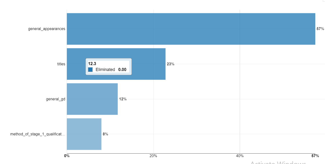
Some variables I processed include:
- Number of historic appearances
- Historical matches drawn
- GA
- GD
- GF
- LOST
- PLD
- PTS
- WON
- Did they qualify at the Qualification stage?
- Matched lost at Qualification stage
- # Qualification Matched Played
- Qualification Stage Points
- # Matches won at Qualification stage
- # AFCON titles
- Qualification stage Group winners
- Qualification stage Group Runners up
- Qualification stage Group Others
The resultant decision tree looks like this:

Variables of Importance

Model Evaluation Parameters
Confusion matrix
* “Optimal” cut was found by optimizing for F1 Score. One way to assess a classification model's performance is to use a "confusion matrix", which compares actual values (from the test set) to predicted values.

What is the quality of the model

This density chart illustrates how the model succeeds in recognizing teams which will proceed from the ones which wont. It shows the repartition of the actual classes in the validation set according to the predicted probability of being of said class learnt by the model. The two density functions show the probability density of rows in the validation set that actually belong to the observed class vs rows that don't.
A perfect model fully separates the density functions:
· the colored areas should not overlap
· the density function of Advance should be entirely on the left
· the density function of Eliminated should be entirely on the right
The dotted vertical lines mark the medians.

Testing the model on Kenyas performance at the AFCON 2019, it appears that Kenya will be eliminated at the group stages.